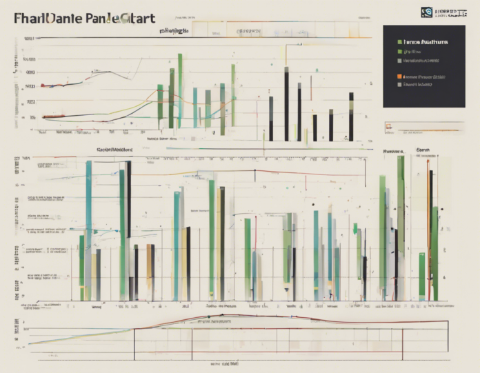
In the world of data visualization, panel charts have emerged as a powerful tool for presenting multiple sets of data in a concise and visually appealing manner. Panel charts allow for the comparison of different data series while maintaining a clear and organized display. In this comprehensive guide, we will explore the ins and outs of panel charts, including what they are, how they work, and best practices for creating effective visualizations using them.
What are Panel Charts?
Panel charts, also known as small multiples or trellis charts, consist of multiple charts or graphs displayed together as a single visual element. Each panel within the chart represents a different subset of the data, allowing viewers to easily compare trends and patterns across multiple categories or variables. Panel charts are particularly useful when working with complex datasets that contain a large number of variables or categories.
There are several types of panel charts, including grid panels, stacked panels, and segmented panels. Grid panels display multiple charts in a grid layout, making it easy to compare trends across different data series. Stacked panels stack charts on top of each other, while segmented panels divide a single chart into multiple segments for comparison.
How Do Panel Charts Work?
Panel charts work by breaking down a larger dataset into smaller subsets and presenting them side by side for comparison. Each panel within the chart typically represents a different category, time period, or variable, allowing viewers to see how each subset of data behaves relative to the others.
To create a panel chart, start by identifying the key variables or categories you want to compare. Then, create separate charts for each subset of data and arrange them in a grid or stacked layout. Ensure that the scales and axes of the individual panels are consistent to facilitate easy comparison across the different subsets.
Best Practices for Creating Effective Panel Charts
-
Choose the Right Type of Panel Chart: Select the type of panel chart that best suits your data and the insights you want to convey. Grid panels are great for comparing multiple categories, while stacked panels work well for showing trends over time.
-
Keep it Simple: Avoid cluttering your panel chart with unnecessary elements. Keep the design clean and minimalist to ensure that viewers can focus on the data.
-
Use Consistent Scales and Axes: Ensure that the scales and axes of the individual panels are consistent to facilitate accurate comparison across the different subsets of data.
-
Provide Clear Labels and Titles: Use descriptive labels and titles to help viewers understand the content of each panel and the overall message of the chart.
-
Utilize Color Strategically: Use color to differentiate between different data series within the chart, but avoid overly vibrant or distracting color schemes.
-
Consider Interactive Features: If creating digital panel charts, consider adding interactive features such as tooltips or filters to allow viewers to explore the data in more depth.
Frequently Asked Questions (FAQs)
-
When should I use panel charts?
Panel charts are ideal for comparing multiple datasets or categories at a glance. They are particularly useful when dealing with complex data that needs to be broken down for analysis. -
How do I create panel charts in popular data visualization tools like Tableau or Power BI?
Most data visualization tools offer built-in features for creating panel charts. Simply select the data you want to display in panels and choose the appropriate chart type from the options provided. -
Can I customize the layout of panel charts?
Yes, panel charts can be customized to fit your specific needs. You can adjust the size and arrangement of the panels, as well as customize colors, labels, and other visual elements. -
What are the advantages of using panel charts over traditional single charts?
Panel charts allow for easy comparison of multiple datasets, making it easier to identify trends, patterns, and outliers. They also help reduce clutter and improve visual clarity compared to displaying multiple single charts on the same page. -
Are there any drawbacks to using panel charts?
While panel charts are great for comparing data across multiple categories, they can sometimes be overwhelming if too many panels are included. It’s important to strike a balance between providing enough information for comparison and avoiding information overload.
In conclusion, mastering panel charts can greatly enhance your data visualization skills and enable you to present complex datasets in a clear and concise manner. By following best practices and considering the specific needs of your data, you can create compelling panel charts that effectively communicate insights to your audience.


